
Learn React by building websites with Next.js
 Kristian Heruc
If you are new to React, my suggestion is to try to build a simple, but production ready website. Learn just enough of React to be able to build upon your existing html/css/js knowledge. If you don't know how to build a website with only html, css and javascript, you should learn that before learning React.
Don't try to learn everything there is to know about React before building your first project, you will quickly get overwhelmed with all the different ways to do the same thing.
There are several common ways to get started with React:
- including React scripts on a HTML website
- using a code playground like CodeSandbox or CodePen
- using the Create React App CLI tool
- using one of the React Frameworks like Gatsby or Next.js
In this guide I'll show you how to build a website with Next.js. There is nothing wrong with other solutions to get started, but I think Next.js provides just the right amount of magic to help you build a production level website without having to learn a large number of new concepts.
We'll create a portfolio website for an imaginary photography studio:

The full source of the website is available on GitHub. Check Live preview.
At the end of this guide, you'll have a production ready website that you should be able to easily adapt to your own needs.
I won't explain how React and Next.js work in advance, my idea for this guide is to explain concepts as we need them and try not to overwhelm you with details. In future posts, I'll try to explain all the different concepts individually.
Step 1: Setting up Next.js
We'll install Next.js following instructions from Next.js docs. Make sure you have Node.js installed on your computer.
Create a new directory for the project anywhere on your computer (I'll use fistudio) and move into it via the Terminal, for example:
  mkdir fistudio
  cd fistudio
Once inside the directory, initialize a new Node.js project with npm:
npm init -y
Then run this command to install Next.js and React:
npm i next react react-dom
Open the whole project folder in a code editor of your choice (I recommend VS Code) and open the package.json file, it should look something like this:
{
  "name": "fistudio",
  "version": "1.0.0",
  "description": "",
  "main": "index.js",
  "scripts": {
    "test": "echo \"Error: no test specified\" && exit 1"
  },
  "keywords": [],
  "author": "",
  "license": "ISC",
  "dependencies": {
    "next": "^9.0.5",
    "react": "^16.9.0",
    "react-dom": "^16.9.0"
  }
}
Next.js requires us to add several scripts to the package.json files to be able to build and run the website:
  "scripts": {
    "dev": "next",
    "build": "next build",
    "start": "next start"
  }
We'll add them to the package.json file like this:
{
  "name": "fistudio",
  "version": "1.0.0",
  "description": "",
  "main": "index.js",
  "scripts": {
    "dev": "next",
    "build": "next build",
    "start": "next start"
  },
  "keywords": [],
  "author": "",
  "license": "ISC",
  "dependencies": {
    "next": "^9.0.5",
    "react": "^16.9.0",
    "react-dom": "^16.9.0"
  }
}
Our website will consist of many React components. While React itself doesn't require you to use a specific file structure, with Next.js you must create a pages directory where you'll put a component file for every page of your website. Other components can be placed in other directories of your choice. For a website that we're building, I recommend to keep it simple and create only two directories, pages for page components and components for all other components.
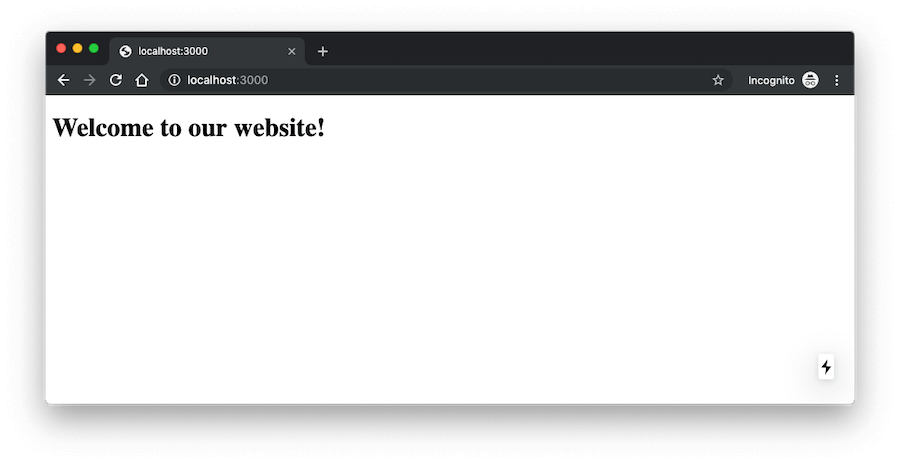
Inside the pages directory, create an index.js file which will become the homepage of our website. The file needs to contain a React component, we'll name it Homepage:
const Homepage = () => (
  <div className="container">
    <h1>Welcome to our website!</h1>
  </div>
);

export default Homepage;
The component returns JSX, a syntax extension to JavaScript which produces React Elements. I won't exaplan JSX in detail, please read the official documentation article.
This is enough to check our progress. Run npm run dev command in the Terminal and Next.js will build the website in development mode. It will be available on the http://localhost:3000 url. You should see something like this:
Step 2: Creating site pages and linking between them
Besides the homepage, our portfolio website will have 3 more pages: Services, Portfolio & About Us. Let's create a new file for each one inside the pages directory:
pages/services.js
const Services = () => (
  <div className="container">
    <h1>Our Services</h1>
  </div>
);

export default Services;
pages/portfolio.js
const Portfolio = () => (
  <div className="container">
    <h1>Portfolio</h1>
  </div>
);

export default Portfolio;
pages/about.js
const About = () => (
  <div className="container">
    <h1>About Us</h1>
  </div>
);

export default About;
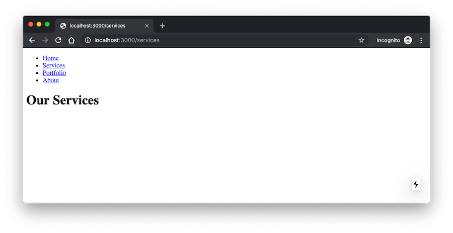
Next.js by default creates a route for every file inside the pages directory. If you visit the http://localhost:3000/services url, the page should display Our Services.
Our next step is to make it possible to navigate between pages via menu links. Next.js provides a Link component for this. Let's create a new Menu component that will contain links to all pages:
Create a components/Menu.js file and add this code into it:
import Link from 'next/link';

const Menu = () => (
  <ul className="menu">
    <li>
      <Link href="/">
        <a>Home</a>
      </Link>
    </li>
    <li>
      <Link href="/services">
        <a>Services</a>
      </Link>
    </li>
    <li>
      <Link href="/portfolio">
        <a>Portfolio</a>
      </Link>
    </li>
    <li>
      <Link href="/about">
        <a>About</a>
      </Link>
    </li>
  </ul>
);

export default Menu;
We're importing the Link component from next/link and we created an unordered list with a link for every page. Keep in mind that the Link component must wrap regular <a> tags.
To be able to click on menu links, we need to include this new Menu component into our pages. Edit all files inside the pages directory, and add include the Menu like this:
pages/index.js
import Menu from '../components/Menu';

const Homepage = () => (
  <div className="container">
    <Menu />
    <h1>Welcome to our website!</h1>
  </div>
);

export default Homepage;
pages/services.js
import Menu from '../components/Menu';

const Services = () => (
  <div className="container">
    <Menu />
    <h1>Our Services</h1>
  </div>
);

export default Services;
pages/portfolio.js
import Menu from '../components/Menu';

const Portfolio = () => (
  <div className="container">
    <Menu />
    <h1>Portfolio</h1>
  </div>
);

export default Portfolio;
pages/about.js
import Menu from '../components/Menu';

const About = () => (
  <div className="container">
    <Menu />
    <h1>About Us</h1>
  </div>
);

export default About;
Now you can click around to see the different pages:
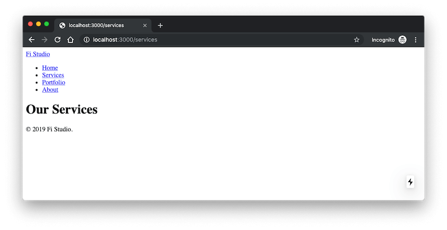
Step 3: Creating the site layout
Similarly how we included the Menu into pages, we could also add other page elements like the Logo, Header, Footer, etc., but it's not a good idea to include all those components into every page individually. Instead, we'll create a single Layout component that will contain those page elements and we'll make our pages import only the Layout component.
Here's the plan for the site layout: individual pages will include the Layout component. Layout component will include Header, Content and Footer components. Header component will include a logo and the Menu component. Content component will only contain page content. Footer component will contain the copyright text.
First create a new Logo component in a new components/Logo.js file:
import Link from 'next/link';

const Logo = () => (
  <div className="logo">
    <Link href="/">
      <a>Fi Studio</a>
    </Link>
  </div>
);

export default Logo;
We imported the Link component from next/link to be able to make the logo link to the homepage.
Next we'll create the Header component in a new components/Header.js file and import our existing Logo and Menu components:
import Logo from '../components/Logo';
import Menu from '../components/Menu';

const Header = () => (
  <div className="header-wrapper">
    <Logo />
    <Menu />
  </div>
);

export default Header;
We'll also need a Footer component. Create a components/Footer.js file and paste this code:
const Footer = () => (
  <div className="footer-wrapper">
    <div className="copyright">© {new Date().getFullYear()} Fi Studio.</div>
  </div>
);

export default Footer;
We could have created a separate component for the copyright text, but I don't think it's necessary as we won't need it anywhere else and the footer won't contain anything else.
Now that we have all the individual page elements, let's create their parent Layout component in a new components/Layout.js file:
import Header from '../components/Header';
import Footer from '../components/Footer';

const Layout = props => (
  <div className="site-wrapper">
    <Header />

    <div className="content-wrapper">{props.children}</div>

    <Footer />
  </div>
);

export default Layout;
The {props.children} will render the actual page content because we'll wrap all content of our pages inside this new Layout component. Edit all pages like this:
pages/index.js
import Layout from '../components/Layout';

const Homepage = () => (
  <Layout>
    <h1>Welcome to our website!</h1>
  </Layout>
);

export default Homepage;
pages/services.js
import Layout from '../components/Layout';

const Services = () => (
  <Layout>
    <h1>Our Services</h1>
  </Layout>
);

export default Services;
pages/portfolio.js
import Layout from '../components/Layout';

const Portfolio = () => (
  <Layout>
    <h1>Portfolio</h1>
  </Layout>
);

export default Portfolio;
pages/about.js
import Layout from '../components/Layout';

const About = () => (
  <Layout>
    <h1>About Us</h1>
  </Layout>
);

export default About;
We no longer need the Menu component inside our pages because it is included in the Header component, which is included in the Layout component.
Check the site again and you should see the same thing as in the previous step, but with the addition of logo and copyright text:
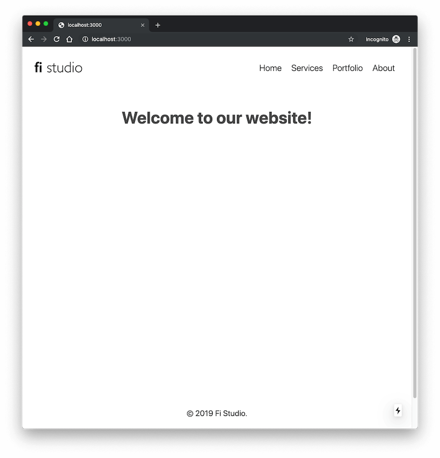
Step 4: Styling the website
There are many different ways to write CSS for React & Next.js. I'll compare different styling options in a future post. For this website we'll use the styled-jsx library that's included in Next.js by default.
Basically, we'll write the same CSS code as we used to for regular websites, but this time the CSS code will go inside special <style jsx> tags in our components.
The advantage of writing CSS with styled-jsx is that each page will include only the styles that it needs, which will reduce the overall page size and improve site performance.
We'll use <style jsx> in individual components, but most sites need some global css styles that will be included on all pages. We can use <style jsx global> for this.
For our website, the best place to put global css styles is in the Layout component. Edit the components/Layout file and update it like this:
import Header from '../components/Header';
import Footer from '../components/Footer';

const Layout = props => (
  <div className="site-wrapper">
    <Header />

    <div className="content-wrapper">{props.children}</div>

    <Footer />

    <style jsx global>{`
      *,
      *::before,
      *::after {
        box-sizing: border-box;
      }

      body {
        margin: 0;
        font-size: 20px;
        line-height: 1.7;
        font-weight: 400;
        background: #fff;
        color: #454545;
        font-family: -apple-system, BlinkMacSystemFont, Roboto, 'Segoe UI', 'Fira Sans', Avenir, 'Helvetica Neue',
          'Lucida Grande', sans-serif;
        text-rendering: optimizeLegibility;
      }

      a {
        color: #1b789e;
        text-decoration: none;
      }

      a:hover {
        color: #166281;
      }

      h1,
      h2,
      h3 {
        margin: 40px 0 30px;
      }

      h1 {
        font-size: 42px;
      }

      h2 {
        font-size: 36px;
      }

      p {
        margin: 0 0 10px;
      }

      img {
        max-width: 100%;
      }

      /* Layout */

      .content-wrapper {
        min-height: 600px;
        text-align: center;
      }
    `}</style>
  </div>
);

export default Layout;
We added <style jsx global> with generic css styles before the closing tag of the component.
Our logo would be better if we replace the text with an image. All static files like images should be added to the static directory. Create the directory and copy the logo.png file into it.
Edit the components/Logo.js file and replace <a>Fi Studio</a> with <a><img src="/static/logo.png" /></a> and add alignment css styles like this:
import Link from 'next/link';

const Logo = () => (
  <div className="logo">
    <Link href="/">
      <a>
        <img src="/static/logo.png" />
      </a>
    </Link>

    <style jsx>{`
      .logo img {
        display: block;
        width: 120px;
      }
      @media (max-width: 600px) {
        .logo {
          display: inline-block;
        }
      }
    `}</style>
  </div>
);

export default Logo;
Next, let's update the components/Header.js file to add some padding and align its children elements with CSS Flexbox:
import Logo from '../components/Logo';
import Menu from '../components/Menu';

const Header = () => (
  <div className="header-wrapper">
    <Logo />
    <Menu />
    <style jsx>{`
      .header-wrapper {
        padding: 30px;
        display: flex;
        justify-content: space-between;
        align-items: center;
      }
      @media (max-width: 600px) {
        .header-wrapper {
          display: block;
          text-align: center;
        }
      }
    `}</style>
  </div>
);

export default Header;
We also need to update the components/Menu.js file to style the menu and align menu items horizontally:
import Link from 'next/link';

const Menu = () => (
  <ul className="menu">
    <li>
      <Link href="/">
        <a>Home</a>
      </Link>
    </li>
    <li>
      <Link href="/services">
        <a>Services</a>
      </Link>
    </li>
    <li>
      <Link href="/portfolio">
        <a>Portfolio</a>
      </Link>
    </li>
    <li>
      <Link href="/about">
        <a>About</a>
      </Link>
    </li>
    <style jsx>{`
      .menu {
        margin: 5px 0 0;
        padding: 0;
        list-style: none;
        display: flex;
      }
      .menu li a {
        font-size: 22px;
        color: #111;
        font-weight: 300;
        padding: 5px 2px;
        margin: 0 10px;
        text-decoration: none;
      }
      .menu li a:hover {
        padding-bottom: 3px;
        border-bottom: 2px solid #ffe525;
      }
      @media (max-width: 600px) {
        .menu {
          display: block;
          margin-top: 20px;
        }
        .menu li {
          display: inline-block;
        }
        .menu li a {
          font-size: 18px;
        }
      }
    `}</style>
  </ul>
);

export default Menu;
We don't need much for the Footer, other than aligning it to the center. Edit the components/Footer.js file and add css styles like this:
const Footer = () => (
  <div className="footer-wrapper">
    <div className="copyright">© {new Date().getFullYear()} Fi Studio.</div>
    <style jsx>{`
      .footer-wrapper {
        text-align: center;
        margin-top: 80px;
        padding: 80px 30px;
      }
      .copyright {
        margin-bottom: 20px;
      }
    `}</style>
  </div>
);

export default Footer;
The website looks a bit better now:
Step 5: Adding content to pages
Now that we have the site structure completed with some basic styling, let's add content to pages.
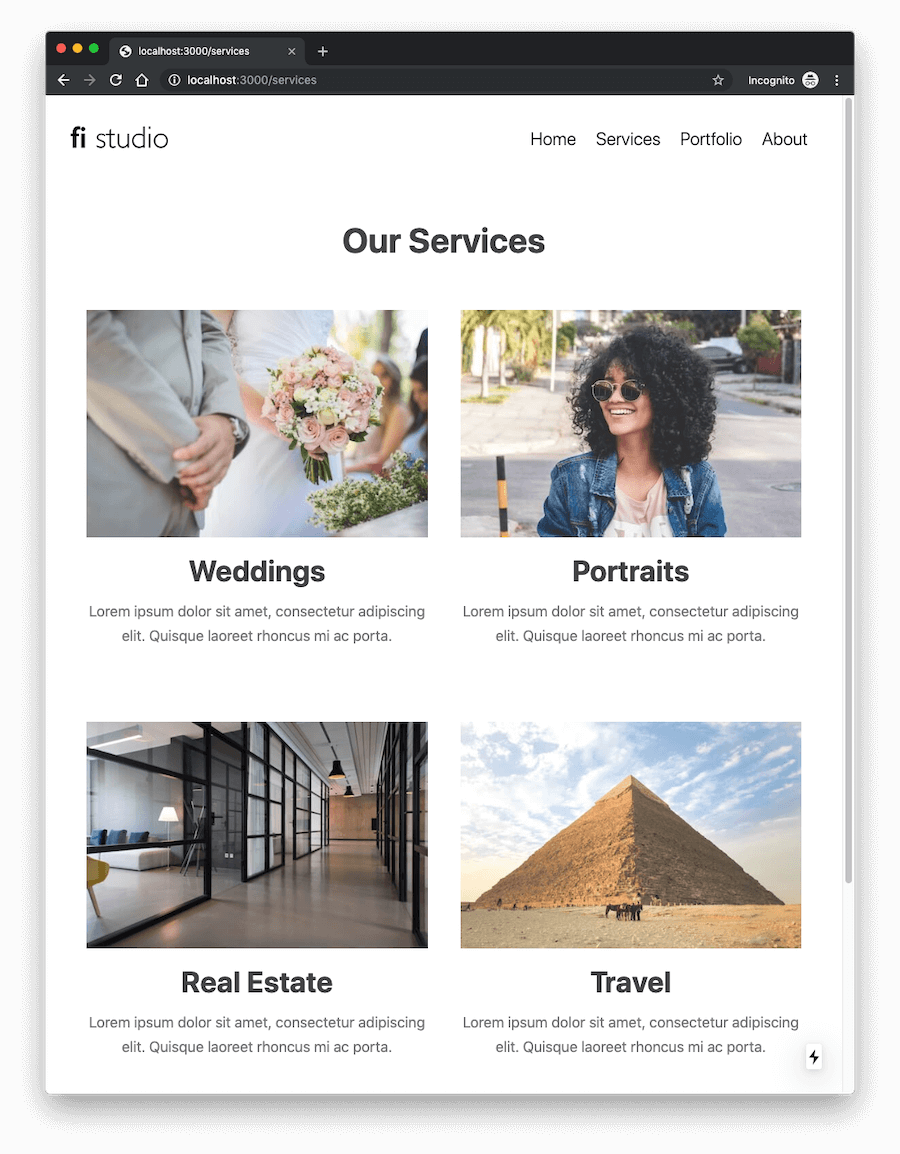
Services page
For the services pages we can create a small grid with 4 images to show what we do. Create a static/services/ directory and upload these images into it. Then update the pages/services.js file like this:
import Layout from '../components/Layout';

const Services = () => (
  <Layout>
    <h1>Our Services</h1>
    <div className="services">
      <div className="services-list">
        <div className="item">
          <img src="/static/services/weddings.jpg" />
          <h2>Weddings</h2>
          <p>Lorem ipsum dolor sit amet, consectetur adipiscing elit. Quisque laoreet rhoncus mi ac porta.</p>
        </div>
        <div className="item">
          <img src="/static/services/portraits.jpg" />
          <h2>Portraits</h2>
          <p>Lorem ipsum dolor sit amet, consectetur adipiscing elit. Quisque laoreet rhoncus mi ac porta.</p>
        </div>
        <div className="item">
          <img src="/static/services/real-estate.jpg" />
          <h2>Real Estate</h2>
          <p>Lorem ipsum dolor sit amet, consectetur adipiscing elit. Quisque laoreet rhoncus mi ac porta.</p>
        </div>
        <div className="item">
          <img src="/static/services/travel.jpg" />
          <h2>Travel</h2>
          <p>Lorem ipsum dolor sit amet, consectetur adipiscing elit. Quisque laoreet rhoncus mi ac porta.</p>
        </div>
      </div>
    </div>
    <style jsx>{`
      .services {
        max-width: 1000px;
        margin: 0 auto;
      }
      .services-list {
        padding: 0 30px;
        display: flex;
        flex-wrap: wrap;
        justify-content: space-between;
      }
      .services .item {
        padding: 20px;
        margin-bottom: 40px;
        width: 50%;
      }
      img {
        max-width: 100%;
      }
      h2 {
        margin: 0 0 5px 0;
      }
      p {
        font-size: 18px;
        color: #777;
      }
      @media (max-width: 600px) {
        .services .item {
          width: auto;
          padding: 10px 20px;
        }
      }
    `}</style>
  </Layout>
);

export default Services;
The page should look something like this:
Portfolio page
This page can have a simple photo gallery of Fi Studio's latest work. Instead of including all gallery photos directly on the Portfolio page, it's better to create a separate Gallery component that can be reused on multiple pages.
Create a new components/Gallery.js file and add this code:
const Gallery = ({ images }) => (
  <div className="gallery">
    {images.map(image => {
      return (
        <div className="image" key={image}>
          <img src={image} />
        </div>
      );
    })}

    <style jsx>{`
      .gallery {
        display: flex;
        flex-wrap: wrap;
        justify-content: space-between;
        margin-bottom: 50px;
        max-width: 1240px;
        margin: 0 auto;
      }
      .gallery .image {
        padding: 20px;
        width: 50%;
      }
      @media (max-width: 600px) {
        .gallery .image {
          width: auto;
          padding: 10px 20px;
        }
      }
    `}</style>
  </div>
);

export default Gallery;
The Gallery component accepts an images prop which is an array of image paths that we'll pass from pages that will contain the gallery. We're using CSS Flexbox to align images in two rows.
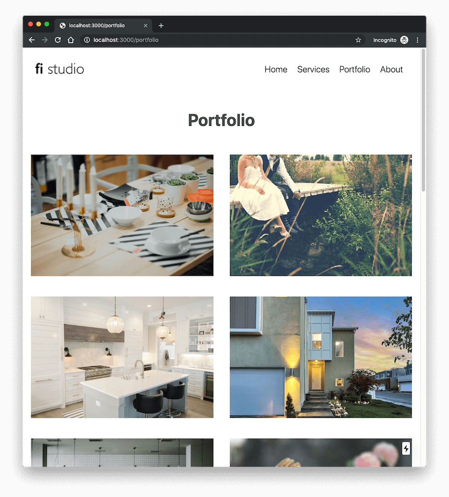
To include portfolio images to the Portfolio page, first upload the images into the static/portfolio/ directory. To keep things simple, I used numeric file names for images so that whenever we add more images, we would only need to update the image count in the Portfolio page to include new images.
Update the pages/portfolio.js file to include the Gallery component:
import Layout from '../components/Layout';
import Gallery from '../components/Gallery';

const Portfolio = () => {
  const images = [];
  const imageCount = 14;

  for (let i = imageCount; i > 0; i--) {
    images.push(`/static/portfolio/${i}.jpg`);
  }

  return (
    <Layout>
      <h1>Portfolio</h1>
      <Gallery images={images} />
    </Layout>
  );
};

export default Portfolio;
We're creating an images array and populating it with image paths based on the overall image count.
The Portfolio page should look like this now:
About Us page
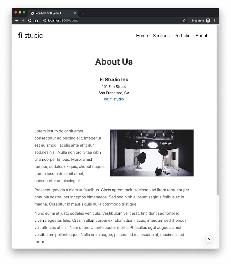
The About Us page will contain company info and some text about the company and a photo. Edit the pages/about.js file and add this code:
import Layout from '../components/Layout';

const About = () => (
  <Layout>
    <h1>About Us</h1>
    <ul className="company-info">
      <li>
        <span className="company">Fi Studio Inc</span>
      </li>
      <li>101 Elm Street</li>
      <li>San Francisco, CA</li>
      <li>
        <a href="mailto:[email protected]">hi@fi.studio</a>
      </li>
    </ul>
    <div className="about-text">
      <img src="/static/studio.jpg" />
      <p>
        Lorem ipsum dolor sit amet, consectetur adipiscing elit. Integer ut est euismod, iaculis ante efficitur, sodales
        nisl. Nulla non orci vitae nibh ullamcorper finibus. Morbi a nisl tempor, sodales ex quis, aliquet neque. Lorem
        ipsum dolor sit amet, consectetur adipiscing elit.
      </p>
      <p>
        Praesent gravida a diam ut faucibus. Class aptent taciti sociosqu ad litora torquent per conubia nostra, per
        inceptos himenaeos. Sed sed nibh a ipsum sagittis finibus ac in magna. Curabitur id mauris quis nulla commodo
        tristique.
      </p>
      <p>
        Nunc eu mi et justo sodales vehicula. Vestibulum velit erat, tincidunt sed tortor id, viverra egestas felis.
        Cras in ullamcorper ex. Etiam diam lacus, interdum sed rhoncus vel, ultricies ut nisi. Nam ut orci at ante
        auctor mollis. Phasellus eget augue ac nibh vestibulum pellentesque. Nulla enim augue, placerat id malesuada at,
        maximus sed tortor.
      </p>
    </div>
    <style jsx>{`
      .company-info {
        margin: 0 0 100px 0;
        padding: 0;
        list-style: none;
        font-size: 18px;
      }
      .company {
        font-weight: 700;
        font-size: 24px;
      }
      .about-text {
        color: #777;
        text-align: left;
        max-width: 800px;
        margin: 0 auto 100px;
        padding: 20px;
      }
      img {
        float: right;
        margin: 10px 0 20px 20px;
      }
      @media (max-width: 600px) {
        .about-text img {
          float: none;
          display: block;
          margin: 0 auto 30px;
        }
      }
    `}</style>
  </Layout>
);

export default About;
The single studio.jpg image should be uploaded to the static directory.
The About Us page now looks like this:
Homepage
For the homepage we'll add a nice cover image and we'll reuse the existing Gallery component to include last 4 images from the Portfolio. Edit the pages/index.js/ file and update the code like this:
import Link from 'next/link';
import Layout from '../components/Layout';
import Gallery from '../components/Gallery';

const images = [
  '/static/portfolio/14.jpg',
  '/static/portfolio/13.jpg',
  '/static/portfolio/12.jpg',
  '/static/portfolio/11.jpg'
];

const Homepage = () => (
  <Layout>
    <div className="cover">
      <div className="hello">
        <h1>Hi, we're Fi</h1>
        <div>A fictional photography studio</div>
        <Link href="/services">
          <a className="view-more">What we do</a>
        </Link>
      </div>
    </div>
    <div className="latest-work">
      <h2>Latest Work</h2>
      <Gallery images={images} />
      <div className="">
        <Link href="/portfolio">
          <a className="view-more">View All</a>
        </Link>
      </div>
    </div>
    <style jsx>{`
      .cover {
        position: relative;
        min-height: 600px;
        background: transparent url(/static/cover.jpg) no-repeat center center;
        background-size: cover;
      }
      .hello {
        position: absolute;
        top: 60px;
        left: 60px;
        background: #fff;
        padding: 30px;
      }
      .hello h1 {
        margin: 0 0 10px 0;
      }
      a.view-more {
        text-transform: uppercase;
        font-size: 16px;
      }
      .latest-work {
        text-align: center;
        padding: 30px 0;
        margin-bottom: 60px;
      }
      @media (max-width: 480px) {
        .hello {
          left: 30px;
          right: 30px;
          font-size: 18px;
          padding: 20px;
        }
        h1 {
          font-size: 28px;
        }
      }
    `}</style>
  </Layout>
);

export default Homepage;
Upload the cover.jpg image to the static directory. Above the cover there's a a small Hello section with a link to the Services page. For the Latest Work section we're including the Gallery component and passing it an images array with paths to the last 4 images that we want to show.
Step 6: Preparing for release
Our website is almost ready now. One thing we need to make sure is that all pages have the required meta tags inside <head>. Next.js provides a Head component for this and a special _document.js file where we can customize the overall page html (which is rendered once on the server side only).
Create a new _document.js file inside the pages directory. The default _document.js from Next.js Docs looks like this:
import Document, { Head, Main, NextScript } from 'next/document';

export default class MyDocument extends Document {
  static async getInitialProps(ctx) {
    const initialProps = await Document.getInitialProps(ctx);
    return { ...initialProps };
  }

  render() {
    return (
      <html>
        <Head>
          <style>{`body { margin: 0 } /* custom! */`}</style>
        </Head>
        <body className="custom_class">
          <Main />
          <NextScript />
        </body>
      </html>
    );
  }
}
We'll modify it to include a favicon, update the pages/_document.js file like this:
import Document, { Head, Main, NextScript } from 'next/document';

export default class MyDocument extends Document {
  static async getInitialProps(ctx) {
    const initialProps = await Document.getInitialProps(ctx);
    return { ...initialProps };
  }

  render() {
    return (
      <html>
        <Head>
          <link rel="shortcut icon" type="image/x-icon" href="/static/favicon.ico" />
        </Head>
        <body>
          <Main />
          <NextScript />
        </body>
      </html>
    );
  }
}
Upload the favicon.ico file to the static directory.
Note: Meta tags for charset and viewport are added automatically by Next.js, it's not necessary to add them manually.
What about meta tags that are page specific? We can use the Head component inside our pages as well. A recommended approach is to do it via the Layout component. Edit the components/Layout.js file and update it like this:
import Head from 'next/head';
import Header from '../components/Header';
import Footer from '../components/Footer';

const Layout = props => (
  <div className="site-wrapper">
    <Head>
      <title>
        {props.title ? `${props.title} | ` : ''}
        Fi Studio
      </title>
      {props.description ? <meta name="description" content={props.description} /> : null}
    </Head>

    <Header />

    <div className="content-wrapper">{props.children}</div>

    <Footer />

    <style jsx global>{`
      *,
      *::before,
      *::after {
        box-sizing: border-box;
      }

      body {
        margin: 0;
        font-size: 20px;
        line-height: 1.7;
        font-weight: 400;
        background: #fff;
        color: #454545;
        font-family: -apple-system, BlinkMacSystemFont, Roboto, 'Segoe UI', 'Fira Sans', Avenir, 'Helvetica Neue',
          'Lucida Grande', sans-serif;
        text-rendering: optimizeLegibility;
      }

      a {
        color: #1b789e;
        text-decoration: none;
      }

      a:hover {
        color: #166281;
      }

      h1,
      h2,
      h3 {
        margin: 40px 0 30px;
      }

      h1 {
        font-size: 42px;
      }

      h2 {
        font-size: 36px;
      }

      p {
        margin: 0 0 10px;
      }

      img {
        max-width: 100%;
      }

      /* Layout */

      .content-wrapper {
        min-height: 600px;
        text-align: center;
      }
    `}</style>
  </div>
);

export default Layout;
We're adding the <title> and <meta name="description"> tags based on the props sent to the Layout from individual pages. If the page doesn't set the title prop, it will be the default Fi Studio.
Let's update our pages to add the title prop to pages, change the existing <Layout> line to:
pages/services.js
<Layout title="Our Services">
pages/portfolio.js
<Layout title="Portfolio">
pages/about.js
<Layout title="About Us">
You can add a description prop as well if you want.
Step 7: Exporting and deploying
Deploying to a custom server / hosting
Next.js supports deploying the website either as a dynamic server side rendered site, or as a static site. For a site like this, I recommend deploying it as a static website.
To do that first we need to export it.
Update the package.json file and add "export": "next build && next export -o public" to the list of scripts like this:
{
  "name": "fistudio",
  "version": "1.0.0",
  "description": "",
  "main": "index.js",
  "scripts": {
    "dev": "next",
    "build": "next build",
    "start": "next start",
    "export": "next build && next export -o public"
  },
  "keywords": [],
  "author": "",
  "license": "ISC",
  "dependencies": {
    "next": "^9.0.5",
    "react": "^16.9.0",
    "react-dom": "^16.9.0"
  }
}
I specified public as the destination folder. You can rename it to something else if you want.
Then we can run npm run export command in the Terminal and Next.js will generate the static website. We can then upload the files from the generated public folder to our server (via FTP for example).
Note: The website in this case must be served from a root domain. If you upload the site to a subfolder, the site's assets won't work. I'll cover this in more details in a future guide.
Deploying the website to ZEIT Now
ZEIT Now is an amazing serverless platform that focuses on simplicity and speed.
First you'd need to create an account at https://zeit.co and download the Now app / CLI tool.
To deploy our website to Now, we only need to run the now command in the Terminal (in the project root directory), no other steps are necessary because ZEIT provides Zero Configuration deployments for Next.js apps.
Now CLI tool will give you a link where you can check your deployment on a now.sh domain. Here is my deployment: https://fistudio-56wzvdh82.now.sh.
Here's the final website:
I hope you found this guide useful and that you were able to complete the website and adapt it to your needs.
What next? Explore both React.js Docs and Next.js Docs. If you'll need additional learning resources, I'm collecting them on the React Resources website where you can find latest articles, videos, books, courses, podcasts, libraries and other useful resources for React and related technologies.
Hi. I'm Kristian, software engineer from Croatia. I'm specialized in building high-performant web apps with React, Next.js, GraphQL, Postgres, Hasura & Node. If you are looking for a team of experienced engineers to build your new app, contact me.